Begin Paid Social

In partnership with performance marketing stakeholders, I led creative development across Little Passports, HOMER, and codeSpark paid social channels—driving performance through visual and conceptual diversity. Our team built a high-volume pipeline of unique concepts, balancing fully branded, product-forward creative with ads that felt organic and native to Meta.

Little Passports By Begin

HOMer By Begin

Through rapid testing, iteration, and a strategic mix of creative approaches, the work delivered a 56% reduction in pCPT over two months for HOMER, demonstrating the power of concept-led, platform-conscious design.

codespark By Begin

THE MILESTONES THAT MATTER

Begin set out to develop a distinct visual language for The Milestones that Matter—their modern approach to developmental milestones. The goal was to create an identity that felt fresh while staying true to Begin’s core brand. To bring this vision to life, I designed a custom wordmark and a flexible system of graphic elements that could adapt across applications. The design builds on Begin’s signature chartreuse and reinterprets familiar brand shapes to create a cohesive yet visually distinct extension of the parent brand.

This conceptual illustration visualizes the milestones, with each one represented by a tile. The design was built to be dynamic, allowing it to adapt and emphasize different messages as needed. While the primary illustration uses a deep green palette, additional colors can be introduced to highlight connections to the 5 Cs—a framework that further categorizes each milestone.

Learn With Sesame Street

Learn with Sesame Street by Begin helps the youngest learners build strong and healthy emotional foundations to serve them for life. First released as a digital app, LWSS has grown into a multifaceted learning program that includes kid and grown-up classes, a grown-up guide, and hands-on kits and printables.

In addition to developing a style guide to encompass both Sesame Street and Begin branding, I provided marketing support as these offerings were released, including the creation of emails, paid social ads, and app store assets.  


Begin Organic Social Visual I.D.


Begin, a leading early childhood learning company, needed to elevate their social presence. As one of the first organic customer touch points, it was important that the visual identity captured the playful yet authoritative spirit synonymous with the engaging products created by Begin’s learning experts. To meet this goal and curate a consistent representation of the brand, I created a system of templates with limited font treatments, colors and graphic elements to unify the feed.


A templated approach allows for enough variety, but still keeps things consistent. Deep green and cream combined with a san serif font sets a scholarly and trustworthy foundation, while the infusion of bright chartreuse, bold lettering treatments, and organic shapes lend the playfulness expected of a child-focused brand.


Cyanotype Notebooks

IMG_5068

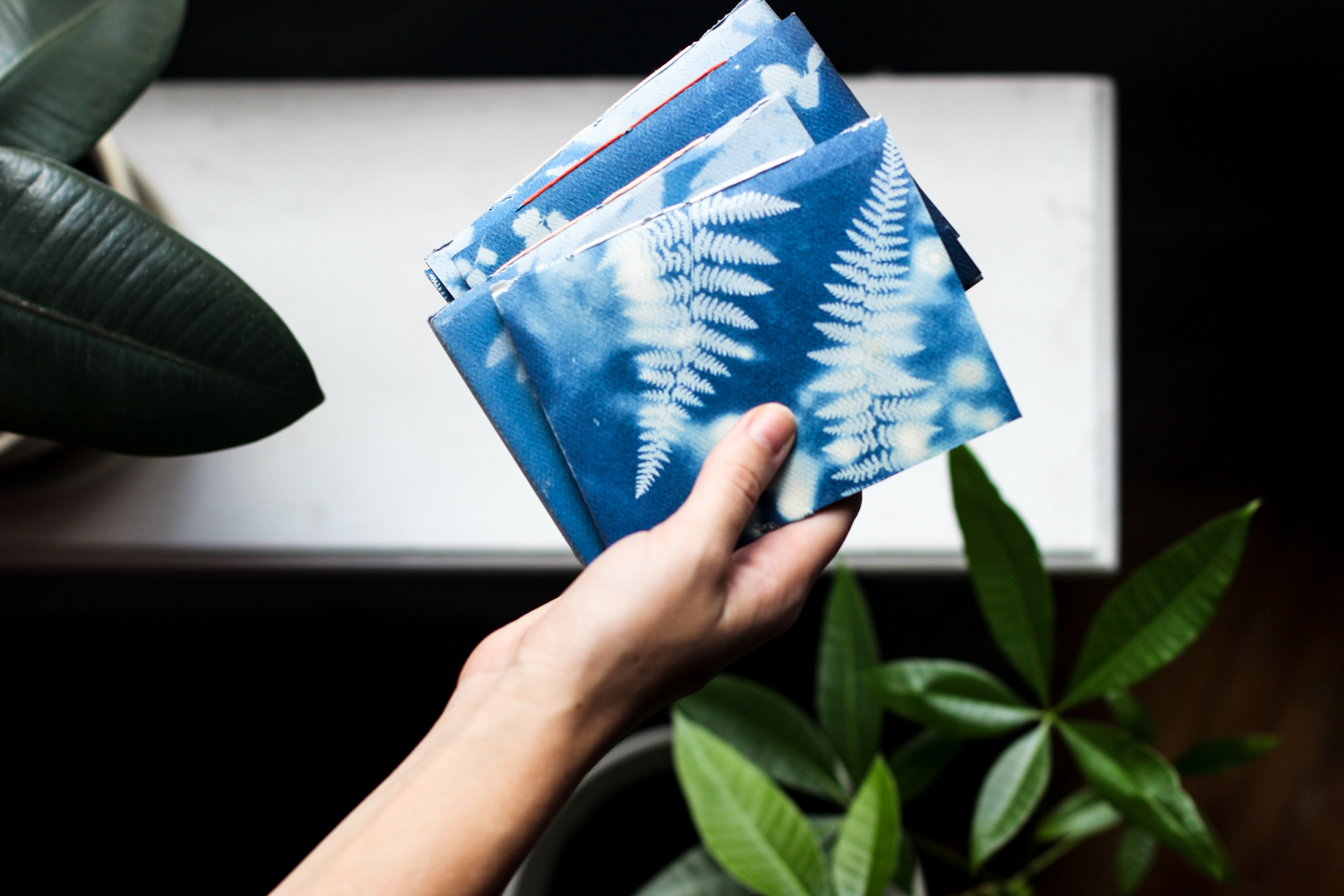
When working on an issue of Deeply Rooted Magazine with the theme of “Light”, I started experimenting with cyanotypes and illustrated an article/tutorial on the subject.  Upon returning to the States after two years abroad, I found prepped paper that had been left in storage, and  decided to see if they would still expose. My little nephews helped me gather and arrange plants, and we developed 8×10 swatches of blue and white botanical patterns.

I decided to turn these patterned papers into simple little saddle-stitch notebooks. Most of my art supplies were still in storage, and we didn’t have a permanent place to live yet, but I had these patterns, brown paper, embroidery thread, and book binding needles at my disposal. It was the perfect opportunity to focus on a single project from start to finish and work on something creative during this time of transition.

IMG_5061

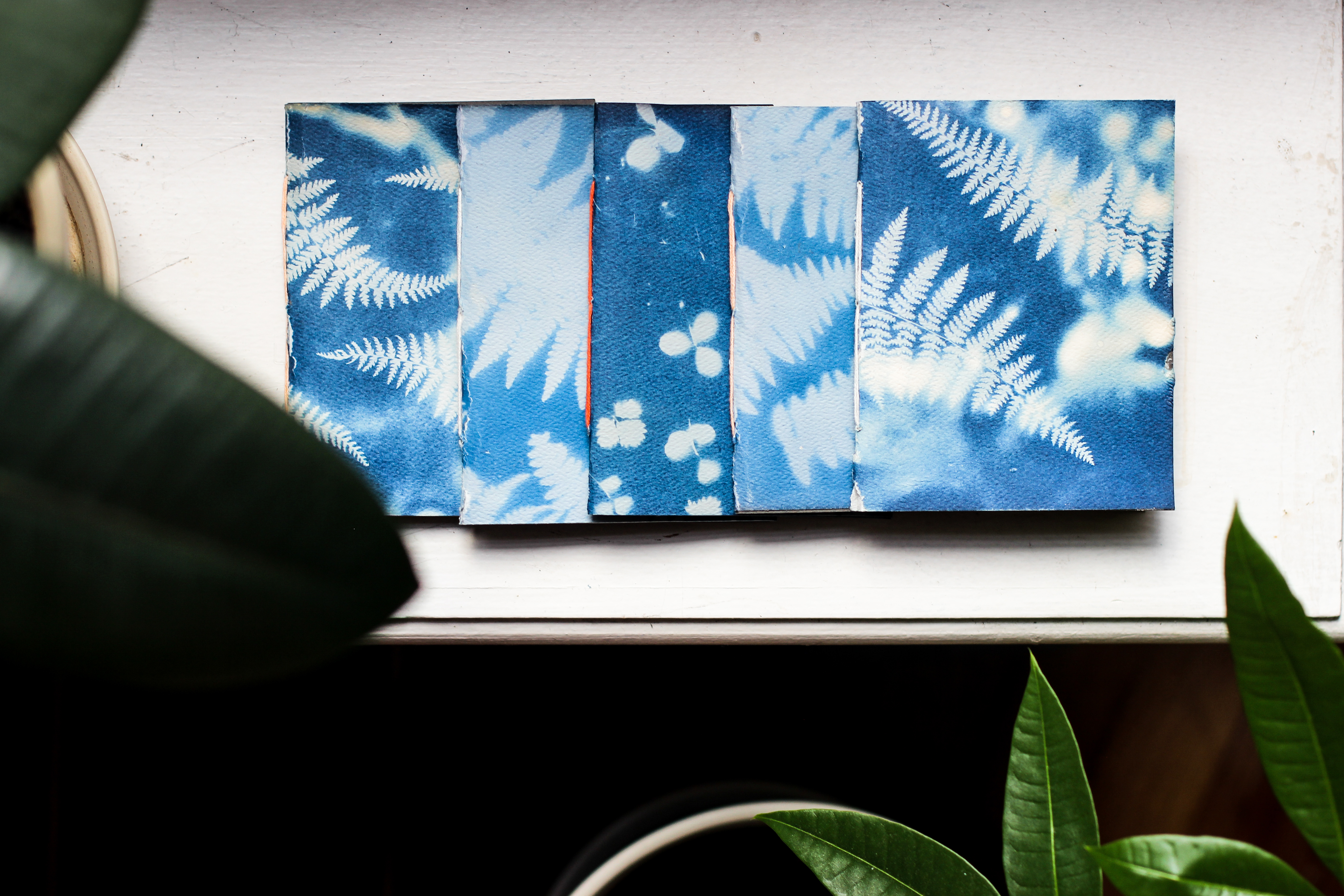
The process of making the books is relatively easy. I cut the 8×10 cyanotypes in half, and cut slightly smaller interior sheets to make up the bulk of the notebook. From there I folded everything in half to form the spine, and measured out the position of three holes for binding. Below is a quick little sketch of the stitching process, as it is better explained in pictures than words.

IMG_8166 copy

While I made these books from custom printed paper, any paper will do! I recommend a heavier card stock for the cover and thinner paper for the interior pages. Happy bookbinding!

Summer Seoul

IMG_6903

When visiting Seoul in the summer of 2016, we found ourselves lost after hiking the fortress wall, but where we ended up was one of my favorite parts of the city. Traditional buildings were sprinkled in between more contemporary dwellings, and I loved the contrast of old and new. Most of the photos I took weren’t compositionally exciting, so I translated my favorite photograph into this drawing.

I started this with oil paint, but I transitioned to drawing with pastel pencil on a teal-painted base after realizing how out of practice I was in painting technique.


Blushington X Erborian Pop-Up

IMG_5132-2


CLIENT| Blushington & Erborian USA

ROLE | Creative Director & Graphic Designer

SCOPE | Concept development and creative execution for a beauty pop-up experience in Project by Equinox.

CHALLENGE | Partnering with Erborian, Blushington wanted to take advantage of NYFW with a pop-up offering express beauty services in Soho, NYC. The signage was created to align with Project’s minimal, gender neutral branding by using hard masculine lines and a limited color palette, softened by hand-written accents.


blushingtonXerborian


Wayfinding components were kept small in scale to be minimally invasive in the Project environment, but spread throughout so that the message was visible in the entryway, workout space, retail area, and bathroom. Where possible, clings were paired with products to encourage testing and drive consumers to the lounge to learn more.


BlushxERB_RetailSignNEW

IMG_5174-3

Extra Matte About It

extramatte


CLIENT| Erborian USA

ROLE | Creative Director & Graphic Designer

SCOPE | Concept development and creative direction for photoshoot of a new product launch, print assets to communicate attributes and spread awareness

CHALLENGE | Extend Erborian USA’s playful & bright brand personality to the launch of a new product: Extra Matte Primer. The photoshoot presents the powdery fresh texture of the primer while communicating the effortless, undone nature and fresh face of the Erborian Girl.


SHOT_11_012

extramatte_5x7

extramatte_mailer


Mixed Media

IMG_5974

I was storing some 5×7’s that had already been prepped with cyanotype solution, and one became slightly exposed to sunlight. I rinsed the solution off and was left with a pale cyan wash – the perfect watercolor-esque drawing surface. Layering on shades of Prismacolor marker and black & white charcoal, I created this little peek into the mountain village of Ta Van, Sapa.

While in Vietnam in December of 2016, this was one of our favorite parts of the country. We arrived at our homestay in the pouring rain, and heavy fog and clouds hung in the sky for most of our visit, but the overcast weather was perfect for long hikes through rice paddies and nights of tea and karaoke.

While most of the residences were scattered throughout the countryside, every so often in our hikes we would come across more densely populated village centers, like the one pictured here.