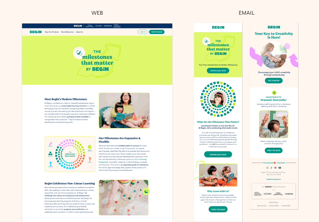
Begin set out to develop a distinct visual language for The Milestones that Matter—their modern approach to developmental milestones. The goal was to create an identity that felt fresh while staying true to Begin’s core brand. To bring this vision to life, I designed a custom wordmark and a flexible system of graphic elements that could adapt across applications. The design builds on Begin’s signature chartreuse and reinterprets familiar brand shapes to create a cohesive yet visually distinct extension of the parent brand.

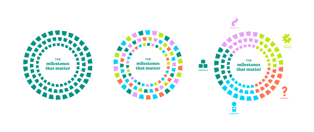
This conceptual illustration visualizes the milestones, with each one represented by a tile. The design was built to be dynamic, allowing it to adapt and emphasize different messages as needed. While the primary illustration uses a deep green palette, additional colors can be introduced to highlight connections to the 5 Cs—a framework that further categorizes each milestone.