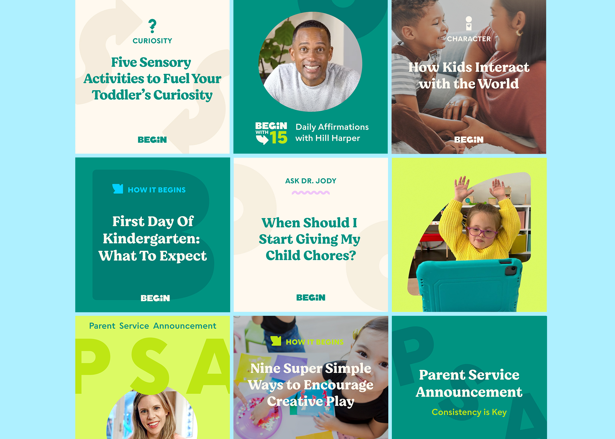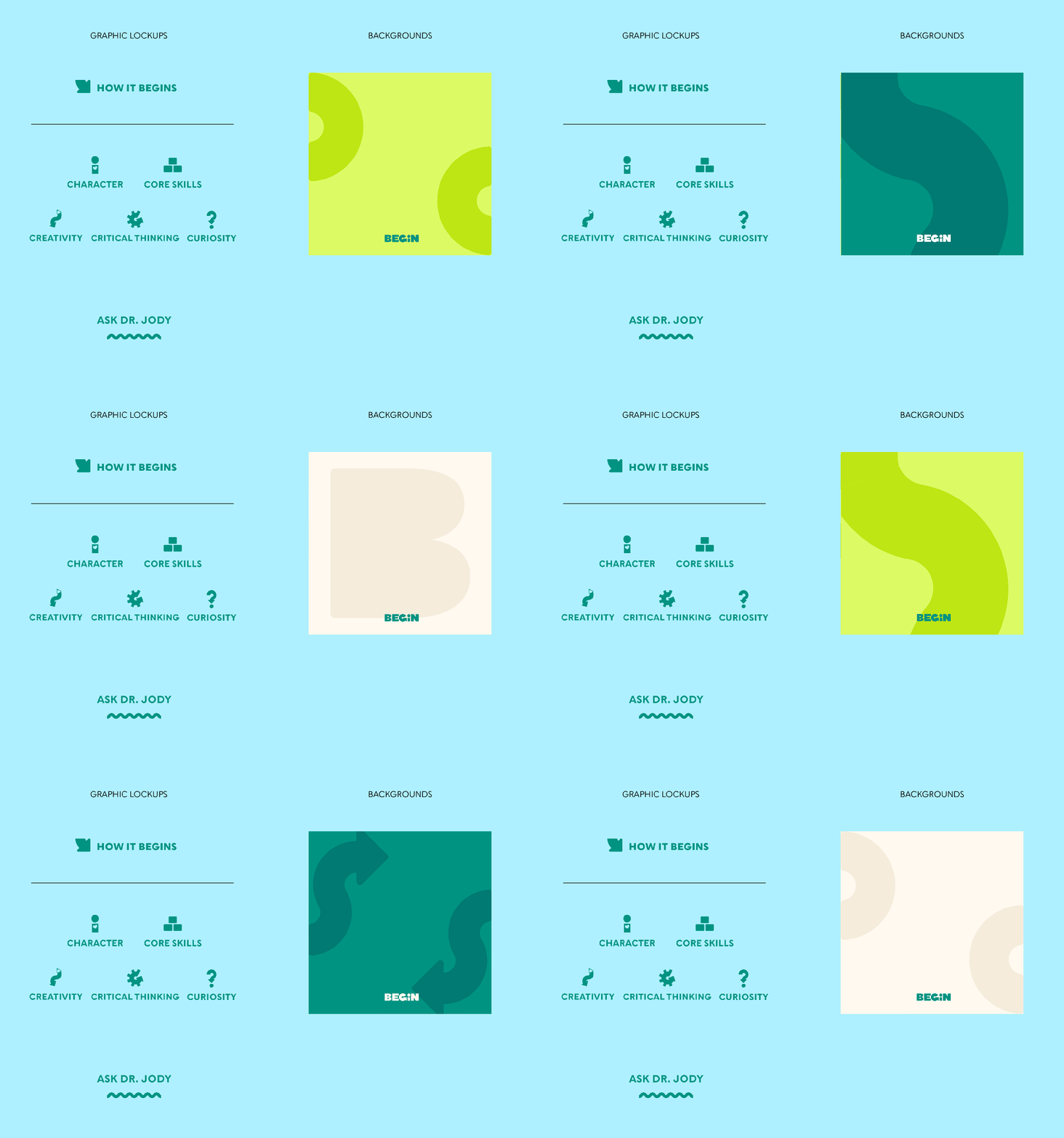
Begin, a leading early childhood learning company, needed to elevate their social presence. As one of the first organic customer touch points, it was important that the visual identity captured the playful yet authoritative spirit synonymous with the engaging products created by Begin’s learning experts. To meet this goal and curate a consistent representation of the brand, I created a system of templates with limited font treatments, colors and graphic elements to unify the feed.

A templated approach allows for enough variety, but still keeps things consistent. Deep green and cream combined with a san serif font sets a scholarly and trustworthy foundation, while the infusion of bright chartreuse, bold lettering treatments, and organic shapes lend the playfulness expected of a child-focused brand.


